The numbers in this case are under the NDA
About Benetton
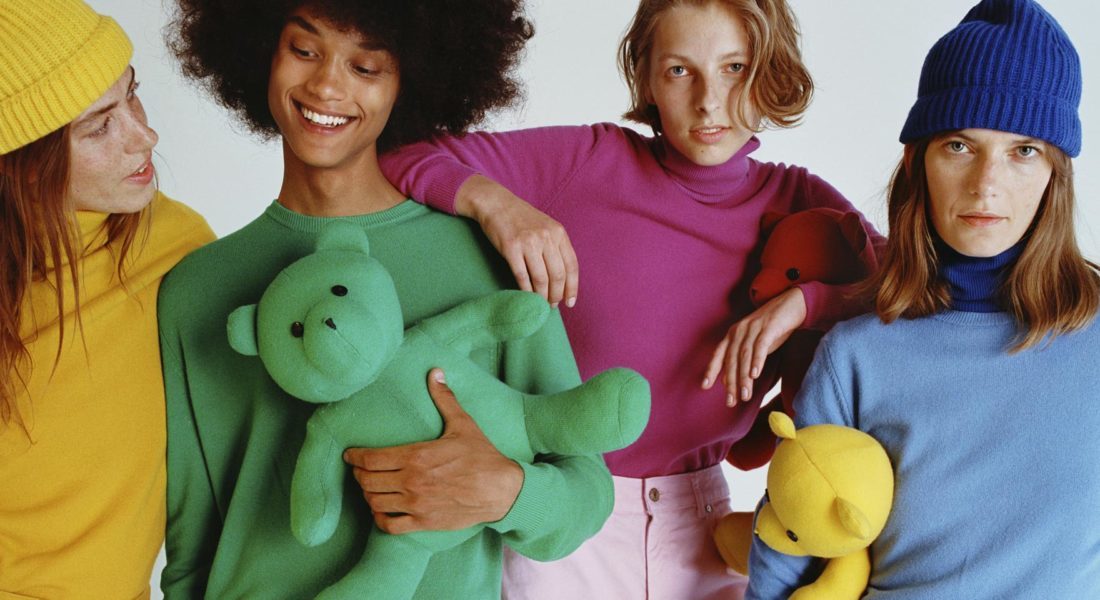
United Colors of Benetton is a popular Italian clothing brand known for bold and vibrant color schemes in clothing creation. The brand’s DNA is diversity, inclusiveness and unification.
The Challenge
We enjoy working with challenging tasks, so United Colours of Benetton was a great example of that.
- Initial goals were set as follows:
- Increase the number of sales online.
- Retain customers through a first-class customer experience and convenient online shopping experience, taking into account the brand core values: diversity, inclusiveness and integration.
Conversion and average check
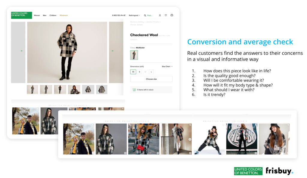
In the process of choosing clothes and accessories, a potential buyer faces various questions and doubts.
What does it look like in reality? What quality should be expected? How convenient will that be? Will it fit me? What should I wear it with? And so on and so forth.
All these questions are equal to the loss in conversion if the brand is not answering them. What if you resolve it proactively, exceeding customer expectations?
Solution
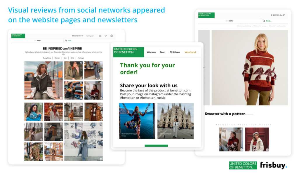
Visual reviews appeared on the website pages showing the customers in different locations, in different types and shapes and characteristics.
User-generated content was placed at multiple locations & channels:
- on the main website page
- in product categories
- in the product cards
- on a special separate page (inspirational page)
- in the newsletters
Loyalty and Virality, Inclusion & Diversity
For retail, the first purchase is just the beginning of the journey. Customer retention, increase in LTV, long-term work is becoming more important than a one-time profit. The solution to this problem is possible only in a comprehensive manner, by improving the customer experience as a whole.
Benetton is very sensitive to customers, we, for our part, have supplemented the pages with a visual social content that helps users make their choice. This is the content of real buyers of all varieties, with their own features. That supports the values of United Colours of Benetton.
The solution
User-generated contents applied to the different points of the website and marketing campaigns as visual proof of compatibility and use of clothes and accessories. Customer can now see other real customers in different shapes wearing Benetton, and that helps him to relate to the product oneself.
Scenarios in use:
1. Community-gallery on website
A separate page on the site with visual reviews of real customers from social networks. So that users can see all the photos from buyers, find their own, be inspired by the images.
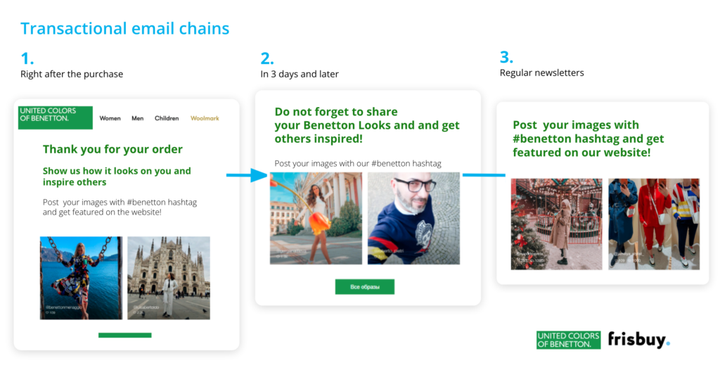
2. Transactional letter chains
We remind customers to share posts with purchased goods, showing examples with real people visual reviews.
At the same time, the content in the newsletters is dynamic. Reviews are collected and moderated for the community gallery and automatically appear in the newsletters. (Right after the purchase, in 3 days and later with additional notifications).
3. Gallery with reviews in product cards
Replaced the classic block of text reviews on the site in the product cards.
UGC on the website works the same way, but the visual format of the reviews has several advantages:
- Better convince visitors, as reviews can be rechecked (meanwhile increasing conversion)
- Demonstrating images, suggesting how one item can fit with another (increasing the average bill)
- Helps visitors to see the product on others like them and to compare with themselves (a sign of care, boosting loyalty)
4. Gallery of reviews in the product category
Works as an additional advantage for an online store with numerous SKUs (product items, Benetton has over 4000 items).
We open the catalogue: a potential client is looking for, for example, a “dress”, and he sees not only offers ranked by the online store. And something suitable for him / her may be hidden on the third page.
Most often, 30% of the catalogue is open in online stores with numerous commodity items. Customer testimonial galleries are like personal shoppers to help customers find something special.
5. UGC gallery on the main page of the site
On the main page we post seasonal and new collections, direct and draw users’ attention to the most relevant pieces.
Results
The introduction of UGC mechanics and real customer reviews on the Benetton’s site had a positive impact on both behavioural metrics and sales. We cannot disclose the numbers (these are under the NDA), but should mention there that in addition to improved standard metrics for an online store, we received an additional profit:
1. Customer care throughout convenient online shopping process
Photos and videos of real buyers appeared on the site, who make purchases on the site and in offline stores day by day. Everyone can match the product to themselves, which aligns with the brand’s values of “diversity, inclusiveness and integration”.
2. A new interpretation of the basic collections
We filled the site with photos from customers with products from the basic collection. We help website users to present a thing in their wardrobe, with which they can be combined and how to unleash their potential.
3. Gender neutrality as a brand value
Most of the products on the website are unisex. We show how women and men, boys and girls can wear the very same thing. Which in general coincides with the trend towards gender neutrality in fashion (and again with brand values).
You may also like
-

Instagram Stories on the website and in the app
December 13, 2021

